Branding
Your look, your name.
The same everywhere.
Branding is how people know it’s you. Your name, your logo, your colors. We make them match on your website, your forms, and your printed reports.
Client
Sample work
Sector
Schools, nonprofits, care
Services
Branding, Print
Year
2026
Stories worth sharing.
Reports worth opening.
Report covers and document themes brought to life through people, photography, and considered page design.
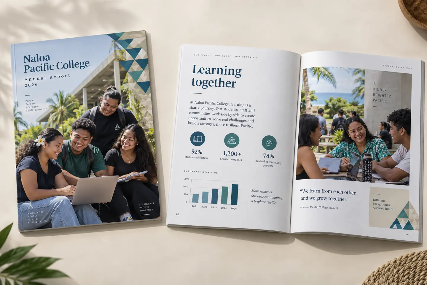
Naloa Pacific College
Annual report: cover photography, editorial layouts, and visual summaries.
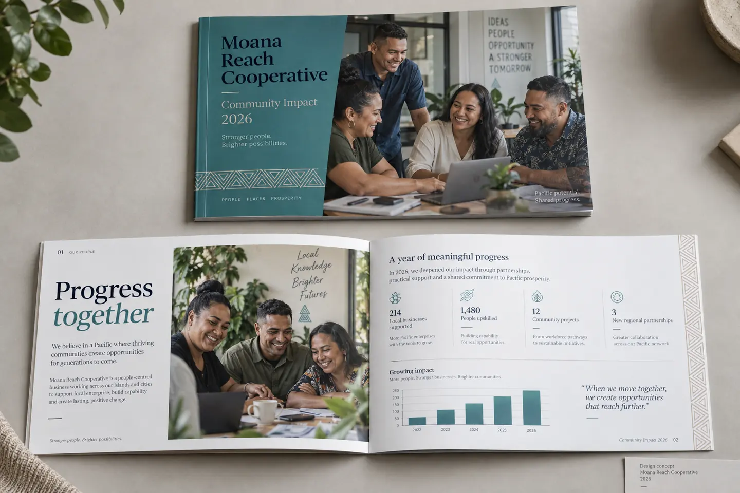
Moana Reach Cooperative
Community impact report: a coordinated cover, people-led stories, and data presentation.
These are mockup images only.
WHAT WE DELIVER
A name if you need one, a mark, two or three colors, one or two typefaces, and a short guide that says how to use them. Everything measured, nothing assumed.
HOW WE TEST IT
Every color pair is measured for contrast before it ships, on screen and in print. The numbers go in your guide so anyone who works with your brand can check them.
WHAT TESTING CATCHES
In our own mark, the two halves measured 2.58 in lightness contrast. They differ in hue but barely in brightness. On screen it read perfectly. Photocopied, faxed, or printed on a mono laser, the split disappeared and the mark became one flat gray shape. Care-home paperwork gets photocopied constantly, so this would have been seen. We found it because we ran the test.